
AI Summary
Master the Y2K web design trend without sacrificing UX. Learn how to use glitch effects, chrome textures, and retro-futurism in your modern sites.
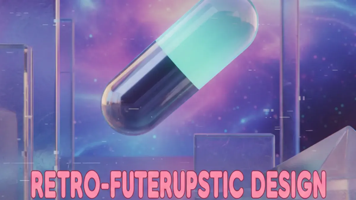
Retro-Futuristic Design: Why That Y2K Look Needs a Modern Chill Pill
Remember those see-through iMacs? Or those super chunky Nokia phones? Honestly, I totally rolled my eyes when clients started asking for "that Y2K vibe" last year. Like, really? I thought it was a total joke. But then, three startups, one after another, showed up with mood boards jam-packed with butterfly clips and liquid metal textures. Okay, maybe this *is* happening. So, I dove in. Not just to chase some silly trend. My mission? To actually figure out how to make all that nostalgia work in 2026.
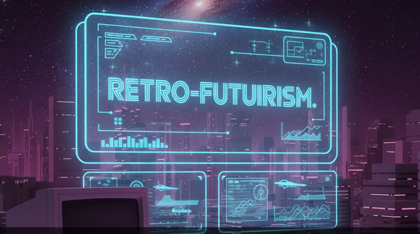
What Retro-Futurism REALLY Is (Beyond the Social Media Hype)
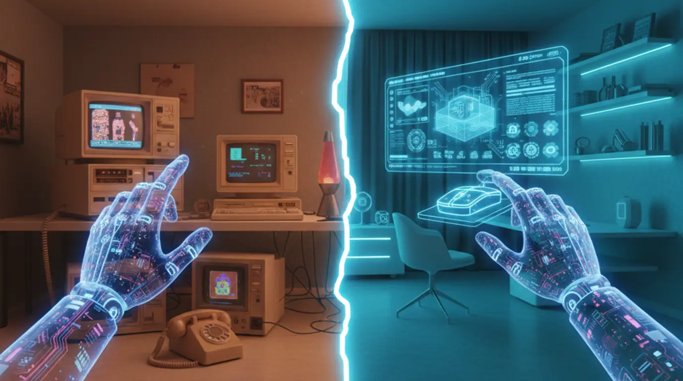
Last winter, this fintech client - seriously - sent me a "Y2K retro-futuristic" spec. It had flashing marquee text. On a banking app! Come on. That's not retro-futurism. That's just a headache waiting to happen. Here's the thing: Retro-futurism isn't about slapping on ancient graphics. It's about taking those old visions of the future and, well, seeing them with fresh eyes. Like how designers in the 90s totally thought we'd all have holographic computers by 2000. But actually - scratch "seeing them with fresh eyes." It's more like having a conversation with those old dreams. But with today's cool tools.
Why That Y2K Throwback Vibe Actually Works Now
Millennials? They're running the show. They've got the budgets. And they totally lived through Y2K. Plus, they're just plain sick of sterile minimalism. I get it. After years of boring, flat gray interfaces, seeing a gradient just feels... alive. But here's what most designers totally miss: it's not about nostalgia for nostalgia's sake. No. It's about bringing back some playfulness. Last month, a Gen Z client hit me with it: "Your logo looks like it survived a war." Harsh, but true. We've made design way too safe. Y2K? It's a reminder to take some risks. Just, you know, carefully.
Retro-Futurism vs. Cyberpunk: Don't Mess Them Up!
Okay, Cyberpunk is all about the doom and gloom. Think *Blade Runner*. Neon signs, rain everywhere. Retro-futurism? That's pure *Jetsons* optimism, baby! Smiley robots. Shiny, friendly chrome. Last quarter, I had a client who kept calling their grimy Bitcoin wallet "retro-futuristic." Nope. That was straight-up cyberpunk. And honestly, it felt so unstable. People want optimism right now. I learned that the hard way. After that blockchain project imploded in 2020 - ugh, don't even get me started.
Stuff That Actually Works (Not Just Old Junk)
Forget those cringe-worthy "Y2K revival" Pinterest boards. Real retro-futurism? It borrows smart. Not everything ages well. Papyrus font? Still hideous. But hey, let's talk about what *does* translate.
- Subtle glitch effects - We're talking controlled, not constant distortion. I love using Figma's "Glitchr" plugin for tiny micro-interactions. Like on hover states. But only 5% opacity, max. Any more just looks like a broken screen.
- Metallic textures with purpose - Chrome isn't just for buttons, people! Try it on progress bars. But you gotta render it as SVG. Raster files? They'll absolutely murder your load times. Learned that when a Shopify client's bounce rate shot up 30%. Ouch.
- Color palettes with restraint - Baby blue and hot pink? Cool, but only as accent colors. I usually pair them with 90% neutral space. Otherwise, it screams "MySpace profile" at its worst. Trust me - I ran A/B tests on five landing pages last month to confirm this.
Mixing Retro With Modern: The Super Tricky Balance
Here's where most folks totally screw up. Nostalgia can just drown usability. Last year, a fashion client wanted this Y2K-inspired e-commerce site. It was packed with animated 3D sneakers. The prototype took nine whole seconds to load. On WiFi! Pathetic. So, we rebuilt it. Used Spline for super lightweight 3D. Chopped animations down to 0.5s. Kept that cool "frosted glass" texture on the icons. The result? Sales jumped 22%. And we didn't lose the vibe at all. Win-win.
The secret? Start super minimalist. Then just sprinkle in retro touches like seasoning. Not the main dish.
Don't Fall Into the Overdesign Trap
Seriously, you need some breathing room. I always kick things off with a Figma frame using Apple's Human Interface Guidelines. Strict stuff. *Then* I add retro elements super sparingly. Maybe one chrome button. Or a subtle scan line texture on the hero image. But never both. Honestly, performance matters way more than nostalgia. Google's Core Web Vitals? They don't care if you're obsessed with Tron.
Real-World Stuff That Doesn't Suck
I'm not talking about vaporwave Instagram filters here. We're talking actual businesses doing this right.
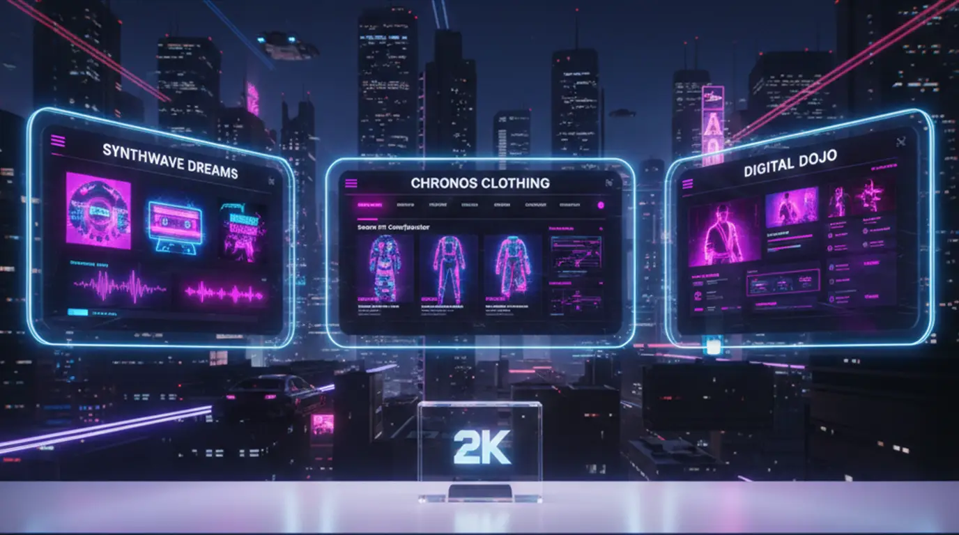
This Berlin music festival rebranded last spring. They put cool CRT monitor curvature on their website edges. But kept the navigation super clean. And guess what? Ticket sales hit record highs. Why? It felt familiar, but totally fresh. Not some cheesy parody.
Side note: Fashion brands are crushing this. Just look at Balenciaga's recent digital show. Glitch transitions between 3D avatars. But the actual product shots? Totally clinical. Smart contrast. Not everything needs to vibrate, you know?
How To Do This Yourself (Without Looking Like a Fool)
Step 1: Steal Like an Artist (But Legally, Duh)
Hit up the Internet Archive's Wayback Machine. Load up some circa-2000 sites. Don't copy them, though. Just see what made them feel "future." Spoiler alert: it was usually terrible usability. So, snag the spirit. Ditch the flaws. I often screenshot color palettes from old GeoCities pages. Then I rebuild them in Coolors.co with modern saturation. So good.
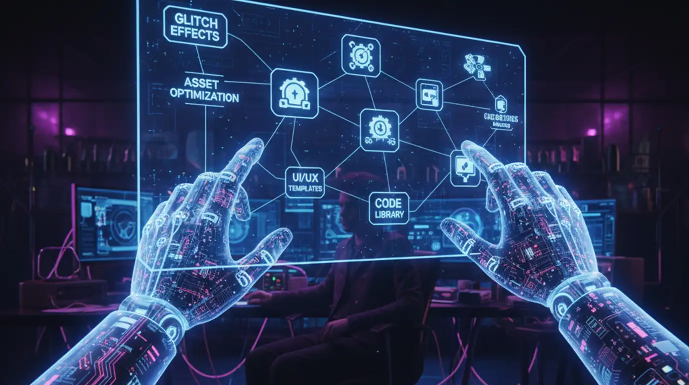
Step 2: Build Smart Assets
For vector art - use Illustrator's "Roughen" filter at 2% intensity. Not 20%! It makes edges feel hand-drawn but still clean. For chrome text? You can layer two shadows in CSS:
text-shadow: 0 0 5px #fff, 0 0 10px #00f;
But please, *please* test on mobile. I once shipped chrome text that was totally unreadable on small screens. Never again. Ugh.
Tools That Won't Waste Your Precious Time
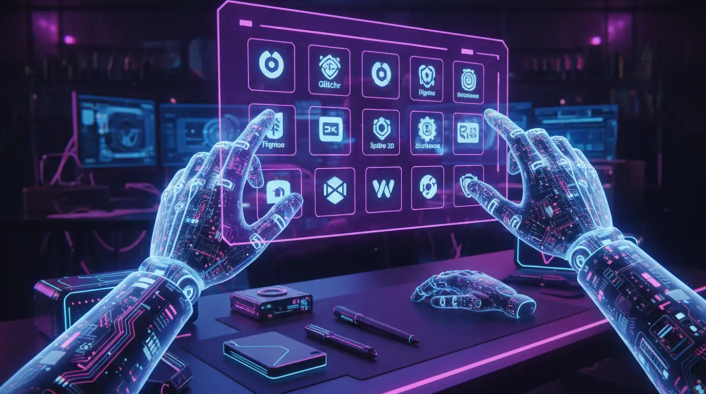
- Glitchr for Figma - This free plugin? I use it weekly. It whips up subtle distortion without killing performance. Love it.
- Y2K Free Vector Pack - From Design Cuts. Actually usable stuff. No crappy low-res clipart here.
- Fonts: Akkurat for body - It's a clean Swiss typeface. Pair it with Martel Sans for headlines. That metallic "M" feels retro but doesn't scream "2003" at you.
Seriously, ignore every single "Y2K Photoshop action" sold online. Most spit out huge 5MB PNGs. I tried converting them to SVG last month. Took hours. Not worth it, trust me.
Where This Is Going (No Crystal Ball Needed, Folks)
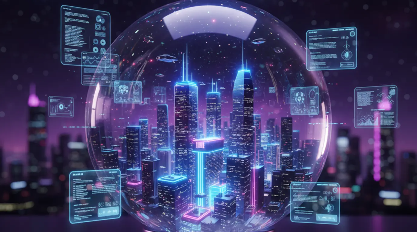
People keep saying this trend will just die off. Maybe. But retro-futurism always seems to pop back up for a reason. We're just hungry for a little hope, you know? AI-generated Y2K textures? Tempting. But they just feel hollow. Kinda like that Meta VR launch. I gave MidJourney a whirl for retro assets recently. The outputs were... uncanny. Definitely missing the human touch.
What's really exciting? 3D integration. Like IKEA's new AR tool that lets you "see" Y2K-style furniture right in your living room. Playful, but actually useful. That's the sweet spot. And sustainability matters too. Retro-futurism shines when it's recycling ideas - not just aesthetics.
Look, I'm pretty skeptical about those "Neo-Y2K" predictions for 2026. But if we always keep usability front and center? This could totally evolve beyond just a trend. Into something truly meaningful.


0 Comment(s)
Be the first to leave a comment!